Rinsed SF
A music collective in San Francisco
OUR ROLE
Brand designers
Scope
Brand design, iconography
-
Rinsed SF is a new music collective bringing good music to unique locations in San Francisco. Their goal is to introduce lovers of dance and culture to the diverse world of house and techno music with their monthly community events. We worked with Rinsed SF to create an edgy yet timeless brand that perfectly represents the company’s goal and tech house culture. The brand elements needed to be unique on their own but still able to collaborate with the brands of venues, artists, or other collectives.
-
A very exciting aspect of this project was the agency the Rinsed SF team gave to us. We were given complete creative freedom from start to finish, which allowed us to fully dive into our process and mastermind the perfect brand.
We began by collecting as much information as we could about the company, its goals, and the culture around house and techno music. With that material, we took to moodboarding to hone in on a design style. The world of house and techno is at the center of interesting design and strong typography. Moodboarding for this project was extremely fun and the perfect start to creating a look for Rinsed SF.
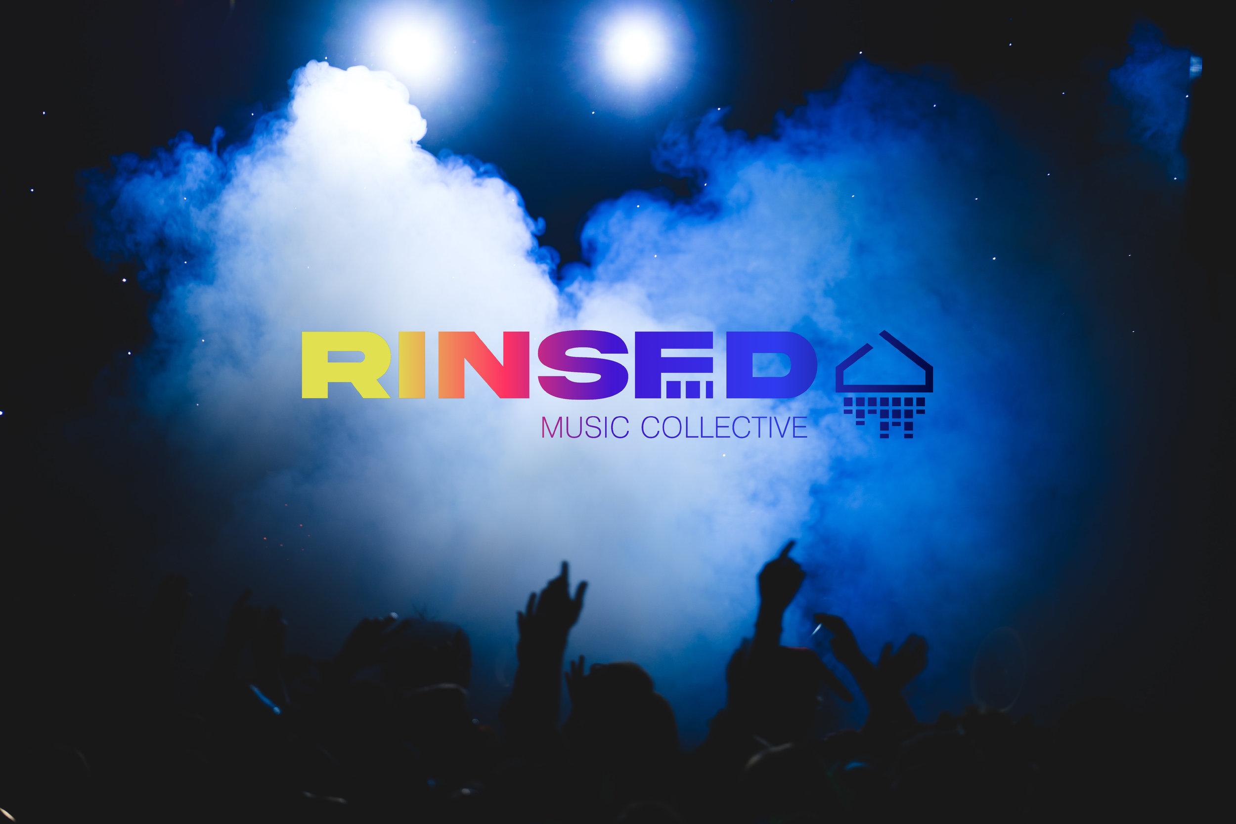
With a decided creative direction, we went to the drawing board. Immediately, we saw the opportunity to get clever with their wordmark. We knew that with whatever type we chose, we wanted to emphasize the letters SF within the word RINSED. We then discovered another intuitive use of negative space to use in the icon. Not only did the black stroke of the icon create a house symbol, its negative space revealed a shower head. With more exploration, we were able to create a main logo, word mark, and two icons that could be used in a variety of outputs.
Last but not least, we finalized the typeface pairing and color palette. We chose Akira Expanded Super Bold and Pragmatica Extra Light because of their simplicity and structure. We curated a color palette that offered a range of hues that could easily transfer over into event facets like trippy visuals, lighting, lasers, marketing materials and even merchandise.
-
The final deliverable was the official Brand Guideline, a comprehensive guide that shows how Rinsed SF should be represented in the world. In addition to the guideline, we created a few launch graphics to announce the rebrand to Rinsed SF’s online community. To make sure their Instagram account matched their new look, we created a social icon, story post, and 3 consecutive grid posts.
Give this fantastic company a follow and be sure to attend one of their future events!